Complete Rebrand
Sonlight
As Design Lead, I was responsible for the User Experience, UI Design, Brand Management, Art Direction, Assisted in Information Architecture, and Motion Graphics
Website
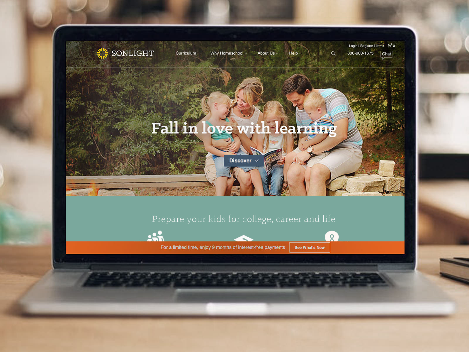
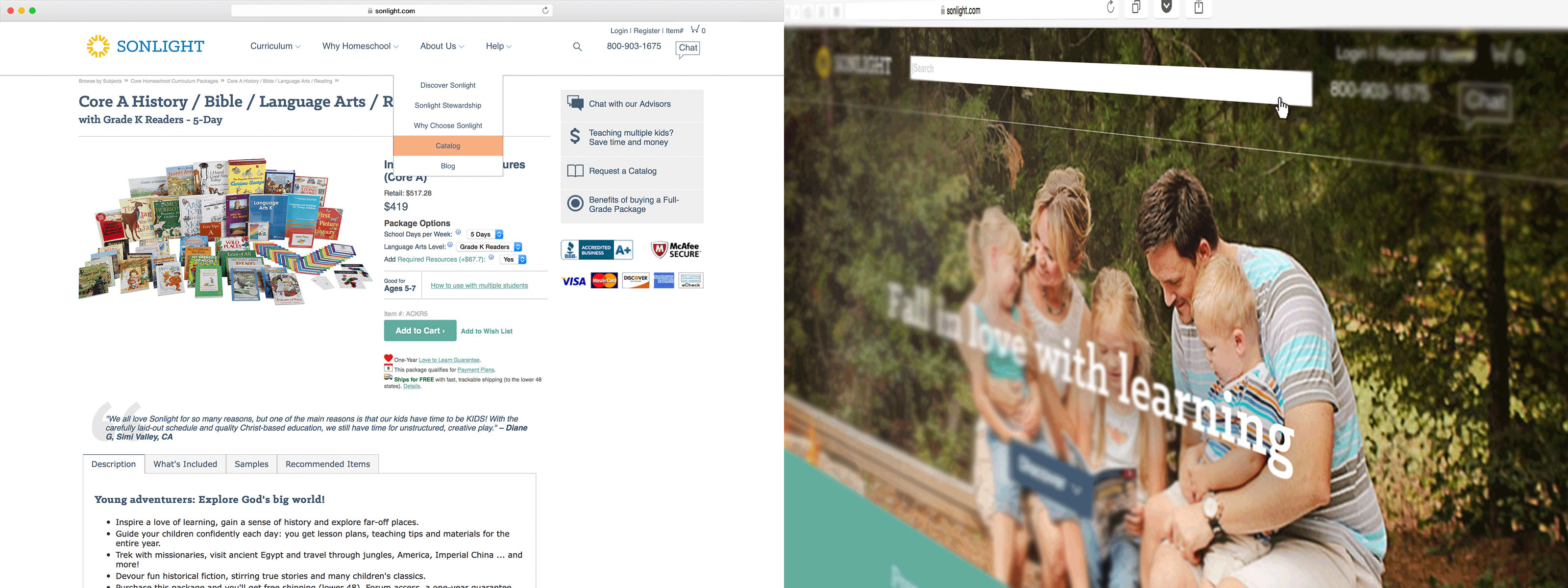
With that rebrand came a refresh of the website. We were prepared to make some dramatic changes. After our team decided what we wanted on the homepage, I went to work concepting to wireframing to hifi comps to then pass to the dev team.
Our objective was to target prospects rather than existing customers while not completely ignoring the latter. To achieve this, we focused on the high level values of Sonlight on an easily digestible homepage.
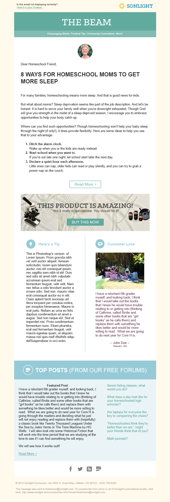
A monthly email newsletter.
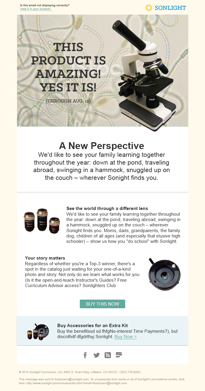
A promotional email.
Video Outro
Pulling from what inspired the logo design, I used a visual of pages and the sound of turning pages to further drive home the idea that the logo is a sun made from books (books being the heart of the company).
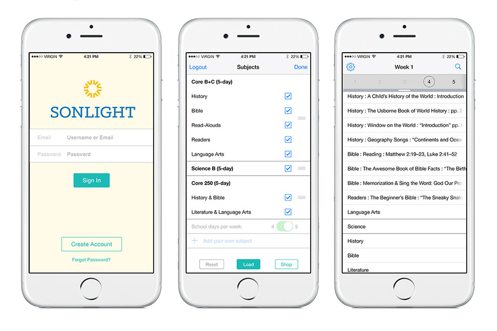
App
With direction from the development crew to keep this app bare bones, I went to work collaborating with a member of the Product Development team and mother. We came up with an app as simple as it is beautiful. Can’t get much more basic than this, ladies!
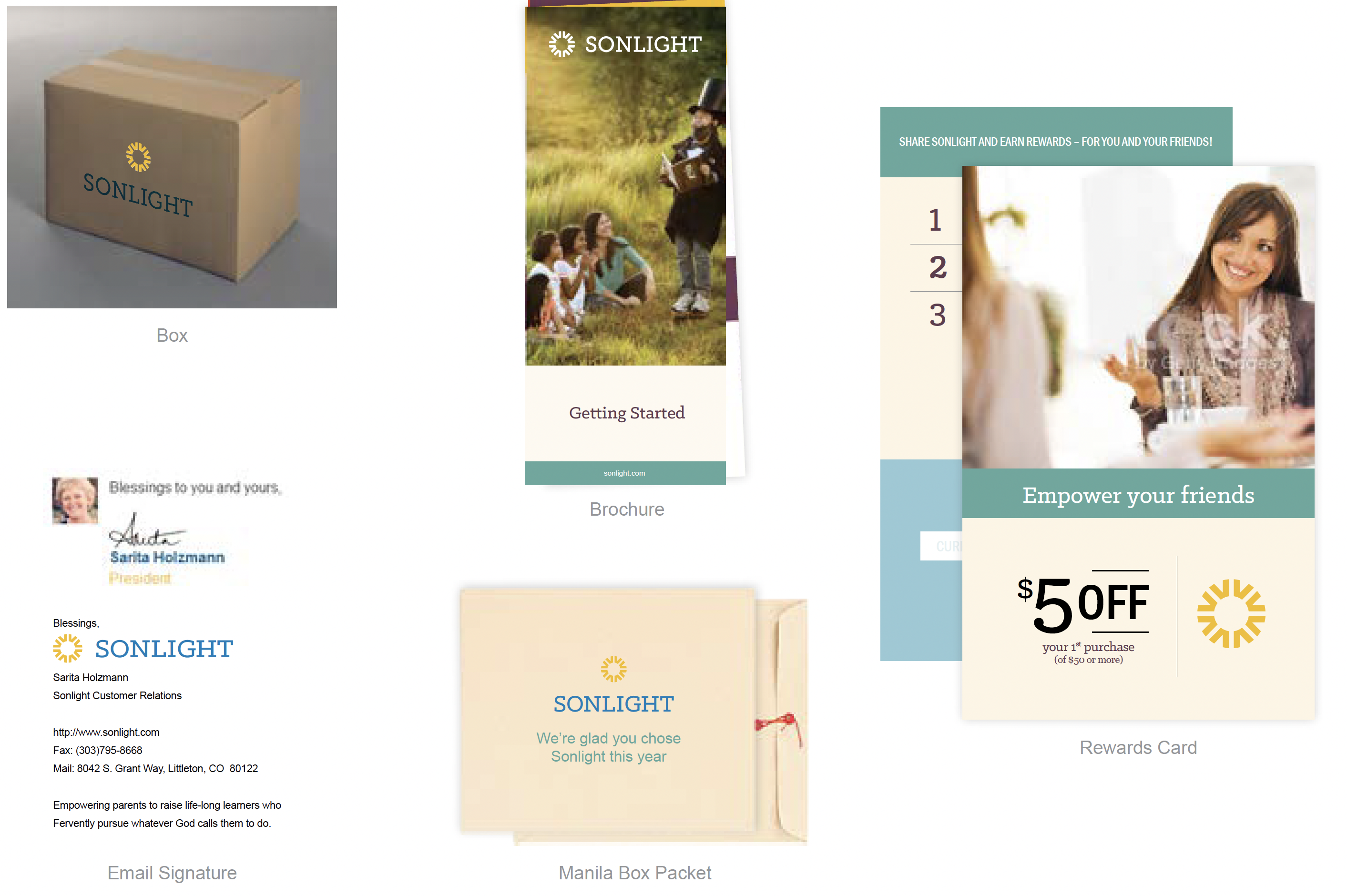
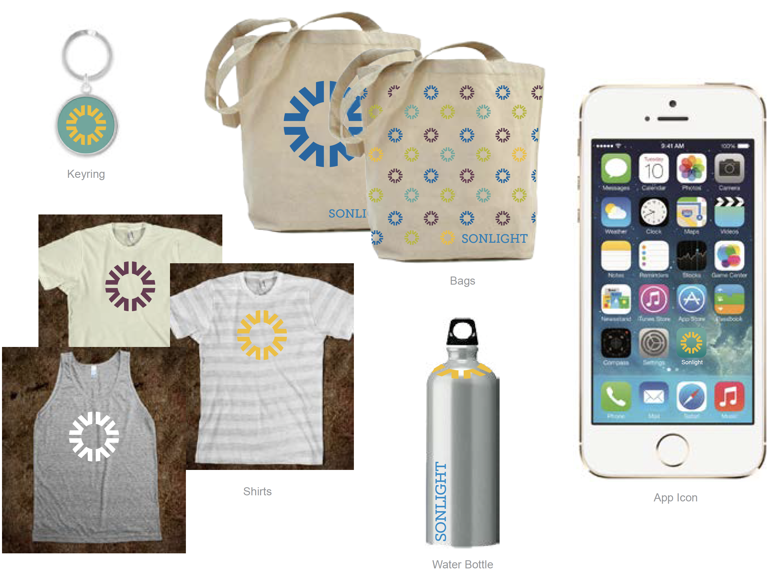
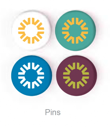
Collateral & Swag
Process
-
DEFINE
Our goal was to reach a new generation of new, younger homeschool moms. So we developed a new brand identity and applied it across the board: sales tools, collateral, product packaging, everything. New logo. New colors. New fonts. New site. New sounds. New standards. We identified competitors. And selected words the company wanted to be associated with.
TrustworthyWarmGlobally-mindedHigh-qualityFamily-orientedEnjoyableRelevant -
DISCOVER
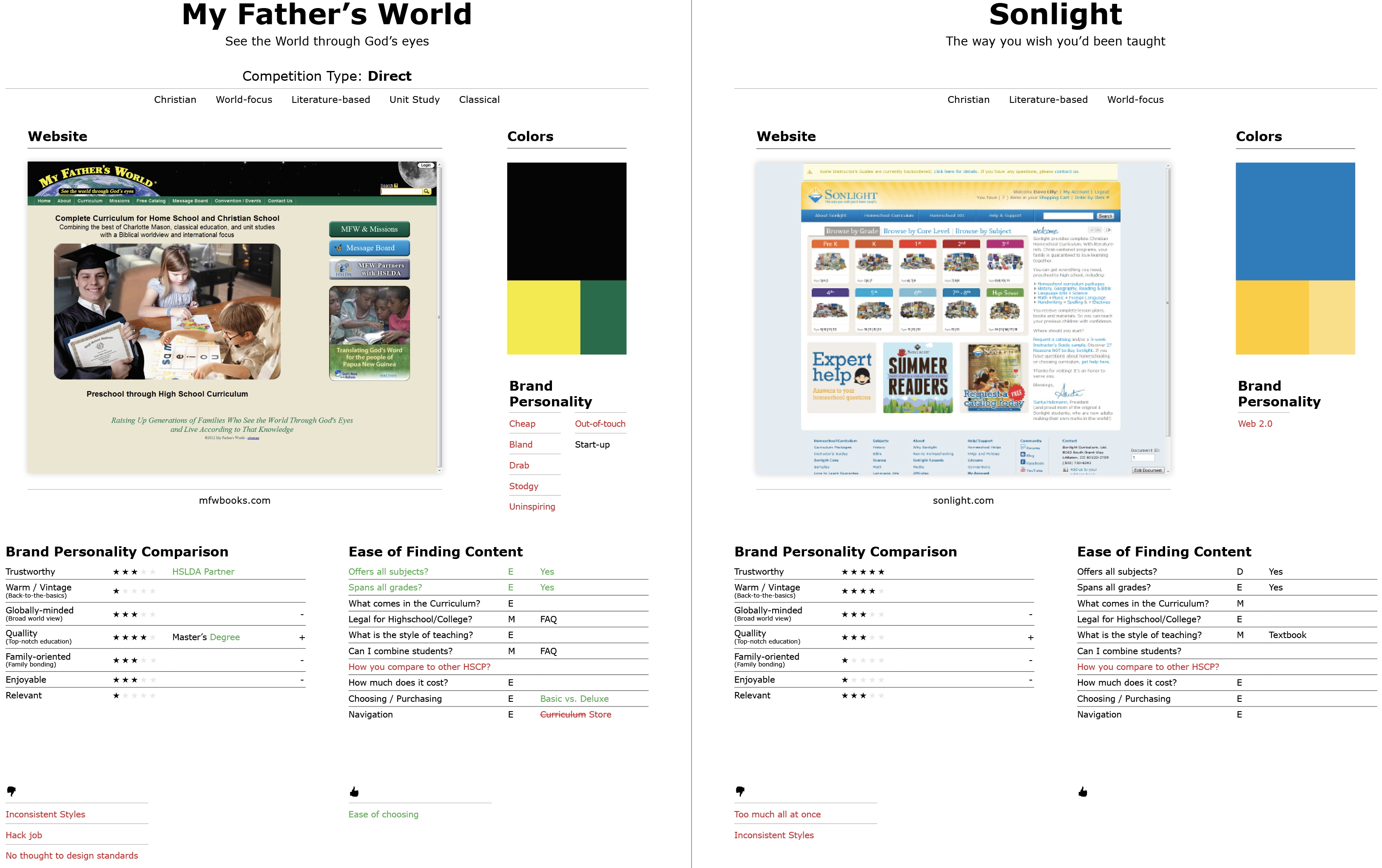
To get a better understanding of the market and to truly set Sonlight apart, I compared Sonlight against its competition. Below is Sonlight's old site compared against its largest direct competitor. See the full list in the Competitor Analysis Doc.
Next, I put together a couple moodboards to help us decide on a course we wanted to take the brand identity.
-
DRAFT
After selecting a warm, modern direction we wanted to take the identity. The logo came together pretty quickly actually. So I went to work applying the near-final logo onto sample materials like a site homepage, site product page, and mailers relying on the moodboards for further guidance on elements like colors, fonts, patterns, etc.
-
DELIVER
Once all the styles were finalized and signed off on, I assembled a style guide using some materials from the DRAFT phase as examples.
-
DROP
Given the amount of materials, in order to launch successfully, I put together a multi-phased plan to progressively update materials. Priority was given to cost-free, digital materials followed by other supplies as they ran low or needed to be resupplied.