Mobile App
Trading
While historically our application was only available in a desktop browser, we believed that we could offer our users some relevant features on a mobile device. With mobile usage having surpassed desktop usage for years and still climbing, it was time to bring the portfolio management experience to our user's mobile devices in a native iOS app.
Services
- User Experience
- User Stories
- Task Flows
- UI Design
- Prototyping
- Script Writing
- User Testing
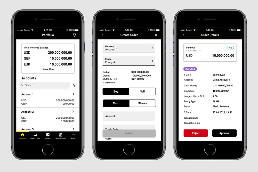
Comps & Flow
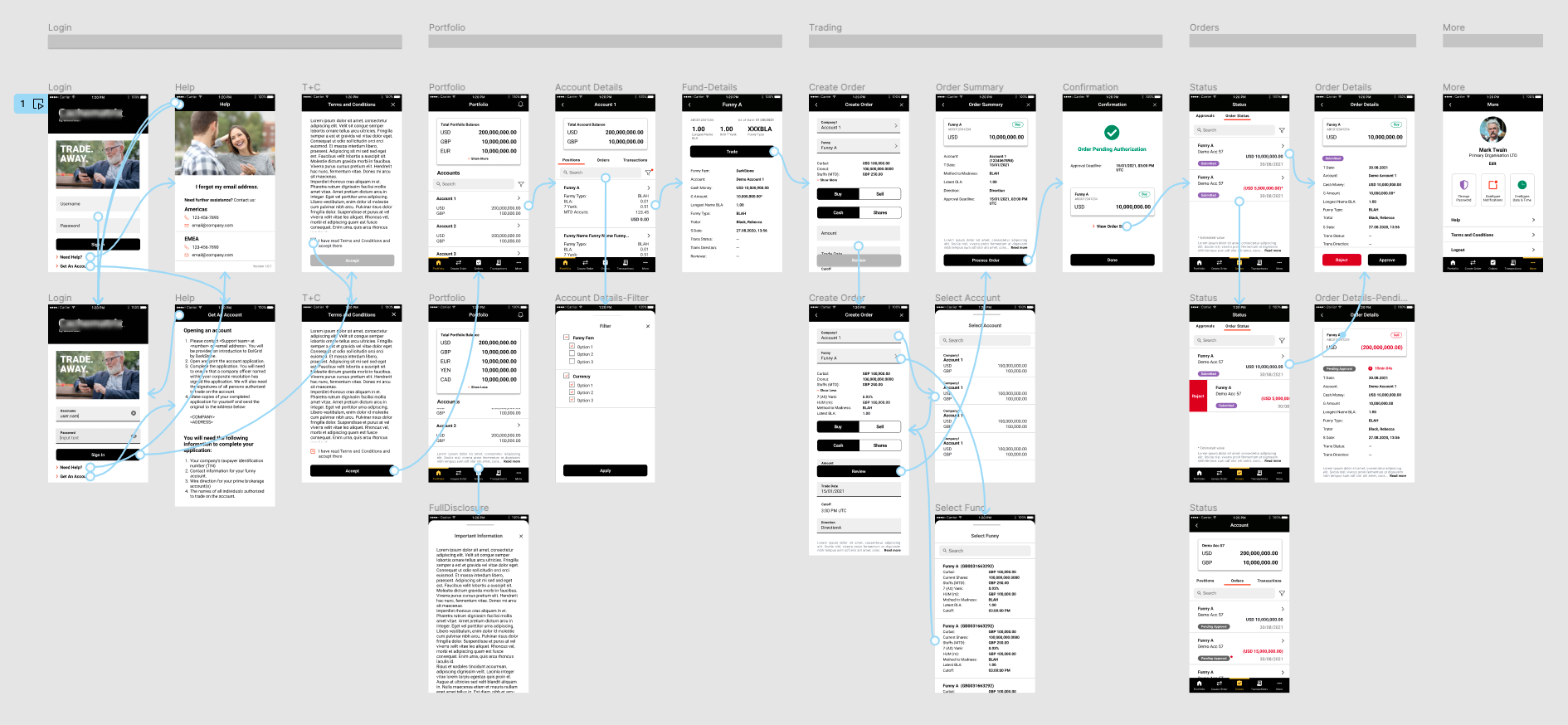
Kickoff & Approach
Having successfully launched an MVP redesign of the entire front-end desktop version in 2020, our team relied heavily on the trading team for business requirements that they had already defined.
Due to the nature of our app, it is very grid heavy, and many features need large amounts of real estate. Given small form factor, we focused on only the most valuable and most used features by current desktop users. These were viewing account balances, trading, and approving colleague's orders.
Process
I began by reviewing the user flows and user stories in the business requirements.
I then developed wireframes to align with the user stories. Interfacing with our BA and developer allowed me to create an extensive library of wireframes to prevent as many gaps as possible.
Before we got too far down our current path, we wanted to test some of our assumptions with users. So, my colleague and I began creating a high fidelity Figma prototype to put in front of users. In conjunction, I went to work creating a script and a list of scenarios to test.
During our 3 user testing sessions, we found there was very little confusion for users. Much of the feedback was positive or future feature enhancement requests (some of which were already in our backlog).
While I aggregated all of our notes from user testing into a report, it became clear that users were eager for a mobile app. And that the direction we were heading met their needs.
Login
Beyond verifying users via a two factor authentication we also wanted to require users to except terms and conditions before entering and using the app. Users could also take obvious steps such as getting help and logging out.
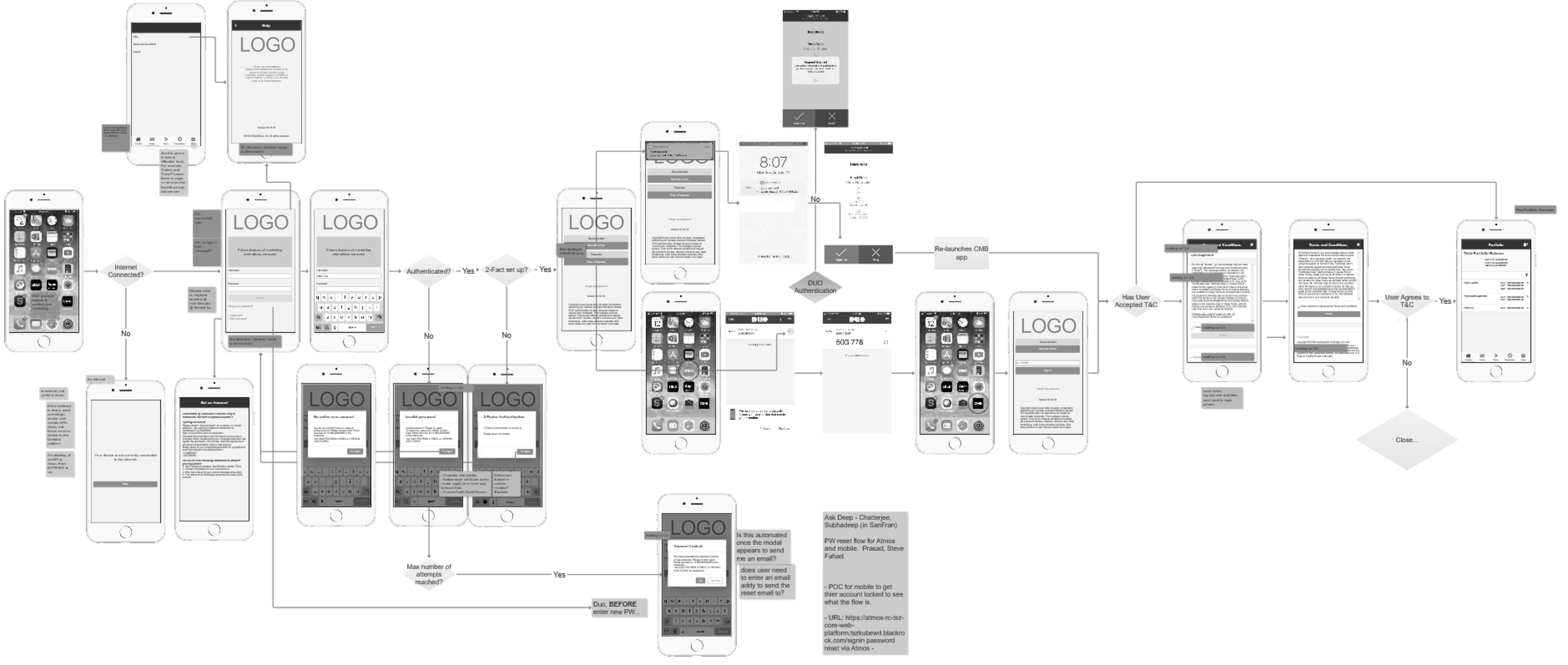
Portfolio
Viewing portfolio balance is one of the most used features of the portal. Therefore it was important to make the portfolio overview page the landing page for the mobile application.
User Stories: As a user I want to…
- Review the total balance of my portfolio divided into currencies
- View a list of each account balance divided into currencies
- View funds and trade history in each account
- View details of each fund so that I can make an informed trade
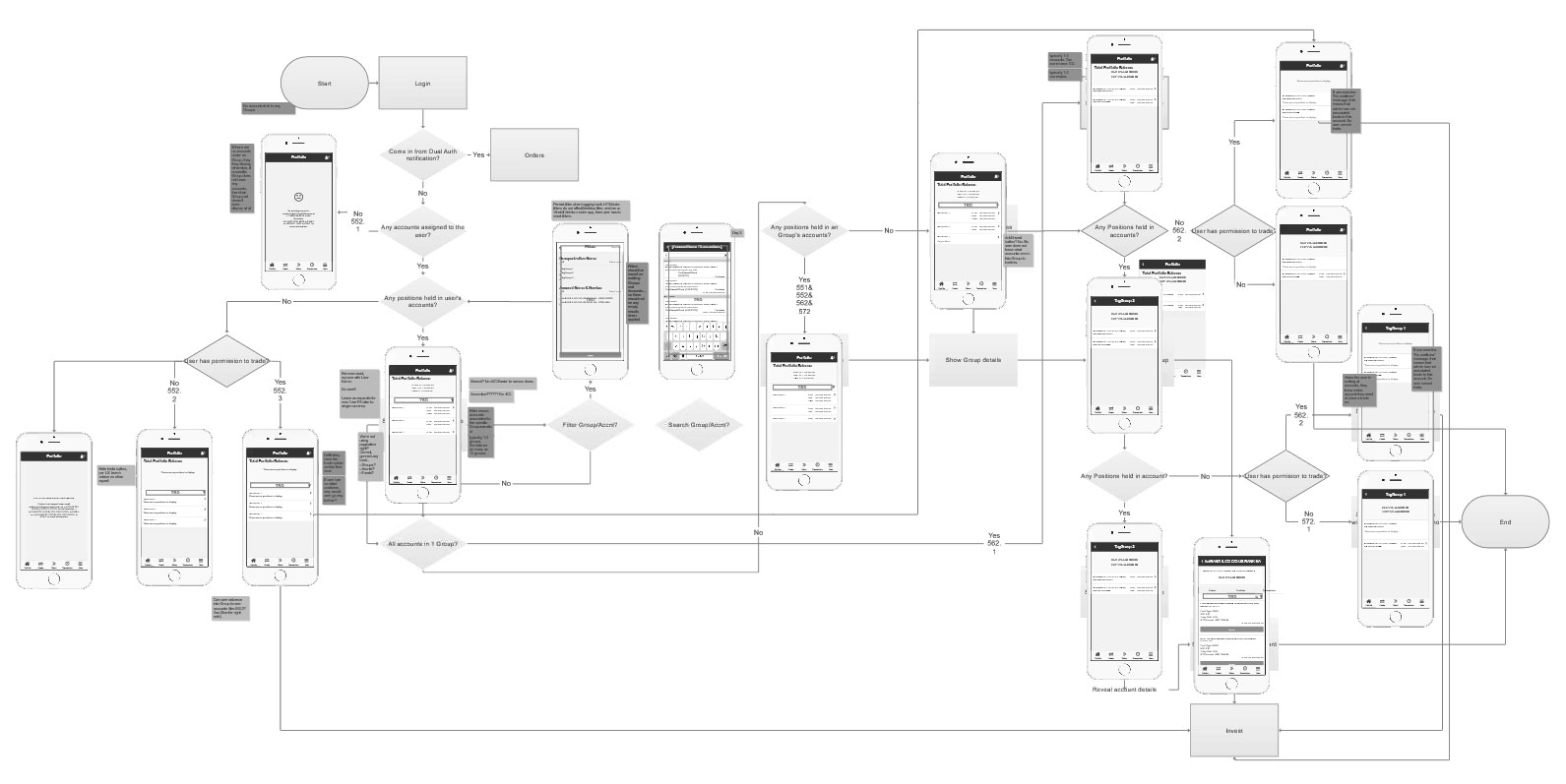
Trading
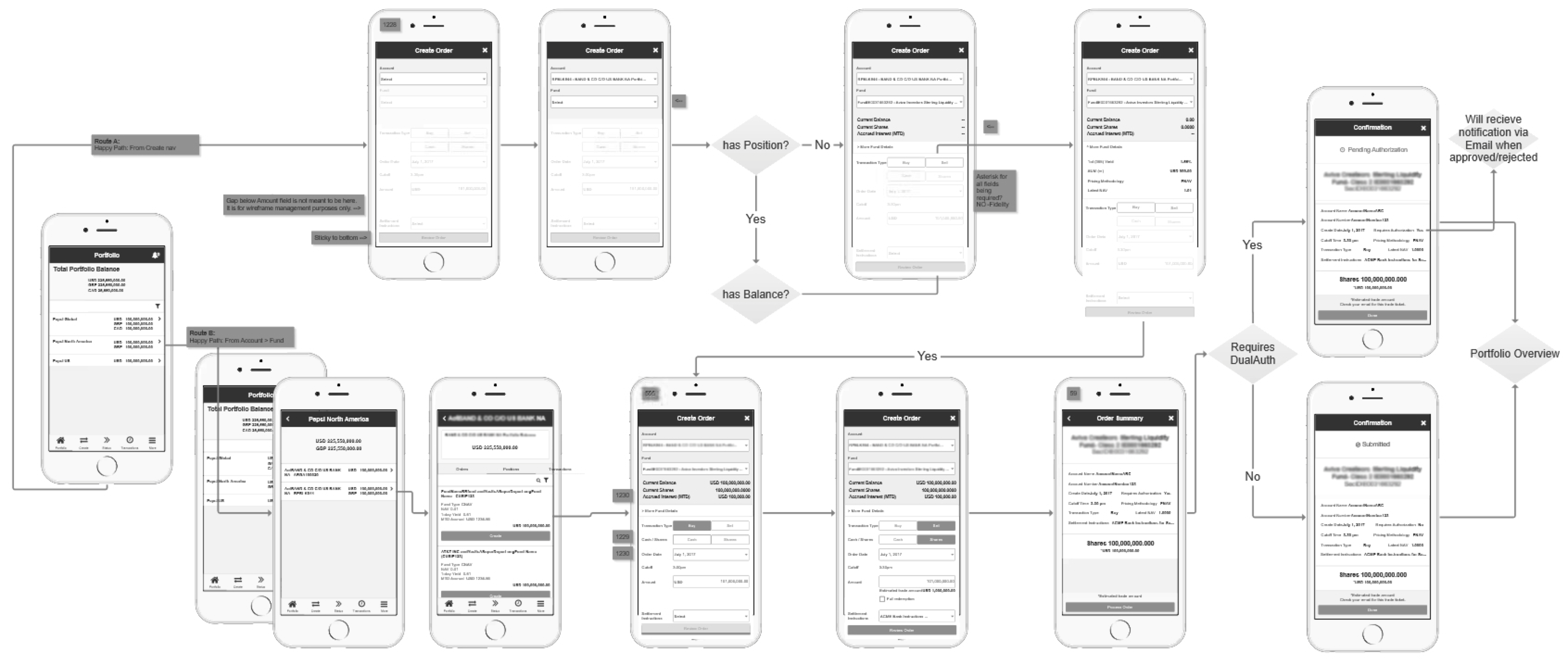
Given trading is the primary activity in our desktop environment, we are bringing it to the mobile app however given the small screen size the experience will be slightly different and tailored to the mobile experience
User Stories: As a user I want to…
- Place a trade
- While in the trade flow, I would like to see both portfolio and view details of selected fund so that I can make an informed trade
- Review a summary of my trade before submission
Orders
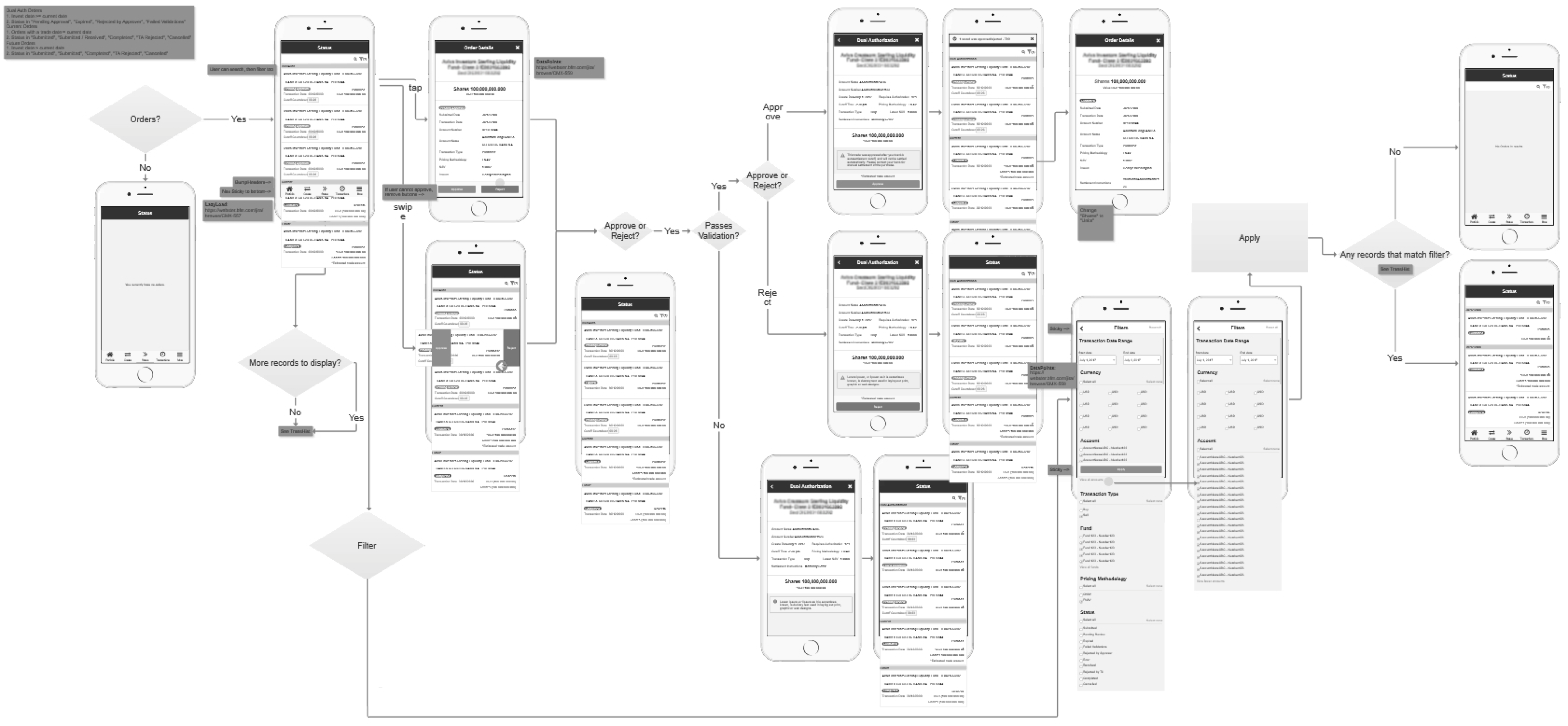
After submitting a trade, be it on desktop or their mobile device, users often wish to check on the status of their order at a later time.
Some user’s orders require colleague approval, and conversely some colleague’s orders may need user approval. So, we allow users to approve their colleagues orders within the app. — We found in interviews that users that this was a great feature to have when an approver is out of office.
User Stories: As a user I want to…
- I’d like to view current day or future day live orders so that I can monitor my account's orders
- I’d like to view all details on an order
- I’d like to filter and search for specific orders
- I’d like to approve or reject colleagues orders within the app
User Feedback
We wanted to validate two major areas:
- Can users create, submit, and review a placed order?
- What is the likelihood of users to adopt a mobile app for trading, approval, and general portfolio review?
Since we had an end of year deadline, we had to backlog much of the feedback, however clients were very pleased, calling the app "very handy"(especially when out of office) and so simple that even a colleague with very little trading experience could trade with confidence.
